Introduced pattern lifted conversion by 30%, retention by 18% across 8+ apps
Context:
GreenTomatoMedia builds mobile party and social games — pick a pack, and the app gives you and your friends something to play together
01
Contribution:
Proposed the segmentation format
Competitor Analysis & User Survey
Researched and defined the format grounded in academic literature and statistics
Designed the party-app question set, answer options, and interaction
Adapted the pattern's pacing and copy for the relationship-app line
02
Goal:
Increase retention and free-trial conversion.
03
Platform:
iOS • Android
04
Results:
Introduced a two-question onboarding step that lifted pre-gameplay completion from 65% to 78%, retention by 18%, and free-trial starts by 30%, across 8+ apps.
Problem Statement & Overview
Onboarding was the last screen before a new player made their first real decision — except there wasn't one. New users landed straight into the app with nothing guiding that first moment, and that gap is exactly where the sharpest early drop-off happened.
A two-question onboarding step closed it, and the results held from the initial pilot through the full rollout across at least seven apps — later generalizing into a second product line without breaking the underlying pattern.
Hypothesis: Together with the PM, we believed introducing a dedicated onboarding step — instead of leaving new users to land straight into gameplay — would close the early drop-off gap.
Process:
Data Analysis -> Brief -> Competitor Analysis -> Cognitive and Behavioral Research -> Strategy -> UX wireframes -> UI Implementation -> User Survey -> A/B Test -> Rollout

Constraints:
The push came from product: retention was down, and the data showed a large share of new users were dropping off before they ever reached core gameplay. Onboarding sits so early in the funnel that it's hard to tell exactly what's wrong without a point of comparison — nothing about it looks broken in isolation. So rather than change multiple things and guess at what worked, we ran a real in-app A/B test on one app first, with nothing else in the app altered for the test's duration, to isolate this change specifically.
Research & Insight
Before designing anything, we researched broadly: competitor onboarding flows, behavioral and cognitive-attention studies, and academic literature on progress indicators.
Competitor analysis alone covered roughly twenty of the largest party and social games, plus a separate look at couple-focused apps. The pattern was clear: most party games skipped personalization almost entirely and used onboarding purely to explain gameplay, while couple-focused apps used personalization far more often.
The same split showed up inside our own portfolio — SexRoulette and JustUs, both built around intimate, one-on-one connection, already leaned on deeper personalization, while familiar-mechanic party games like Truth or Dare Fun and PartyCircle stayed fast and instructional. That distinction, confirmed both externally and in our own apps, is what later shaped which apps got question-based onboarding and which got the simpler informational version (see Key Decisions).
Research from outside the games category reinforced the same tension from a different angle: onboarding that asks for information has to earn it — briefly, and with a clear explanation of why the data is being collected — or it costs more in abandonment than it gains in personalization.
That's the exact principle the pre-launch survey later confirmed independently (see Validation), and part of why "does the user understand why we're asking this" got so much weight in the final question copy.

The progress-bar literature specifically was mixed rather than conclusive — published studies disagreed on whether progress indicators helped completion at all, with the more consistent finding being that an indicator matching a user's actual expectations mattered more than its exact format. Weighing that literature, I landed on a simple step-based indicator without a percentage, which had the most consistent — if modest — support across the studies I found, and it later became the standard across every app in the lineup. One further find shaped the questions' actual content: an article on micro-surveys — using a couple of lightweight questions not just to onboard someone, but to collect usable data — is what gave the two-question format its second job. Instead of only personalizing the very next screen, the answers became a small, ongoing dataset the content team could act on later (see Outcome).
Key Decisions
1. Defined the onboarding format end-to-end — questions, segmentation, and interaction design
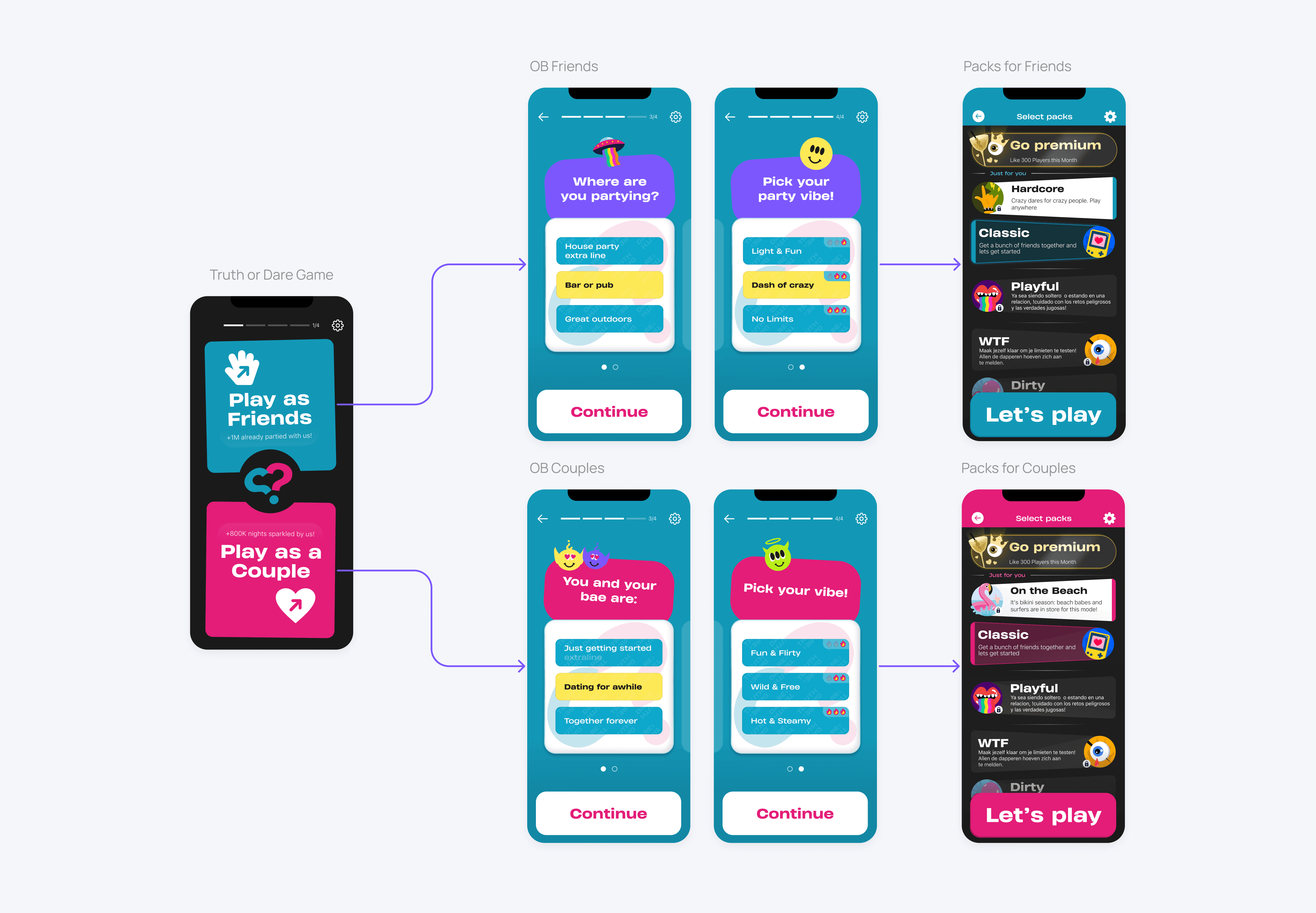
I suggested the specific questions, proposed the segmentation logic (one question per screen for apps with simpler visual style, two per screen for apps with extensive illustrations), and designed the full interaction — clear, obviously tappable button shapes, distinct feedback on selection, and small decorative elements for extra fun that stayed small enough to never distract from the content itself. Text areas are adapted for localization.
The two questions themselves were "Where are you?" (home, bar, outside), used to surface relevant challenges, and "What's your mood?" (light and fun, moderate, super crazy), used to surface pack intensity — with real alternatives ruled out along the way: we deliberately skipped asking age or group size, since both felt intrusive with no clear payoff for the user.
For apps whose content actually supported both, we added a third question — playing with friends or as a couple — since the answer did more than sort content: it also changed the illustrations and decoration on the questions that followed, and fed into package segmentation.

2. Adapted pacing for a second product line
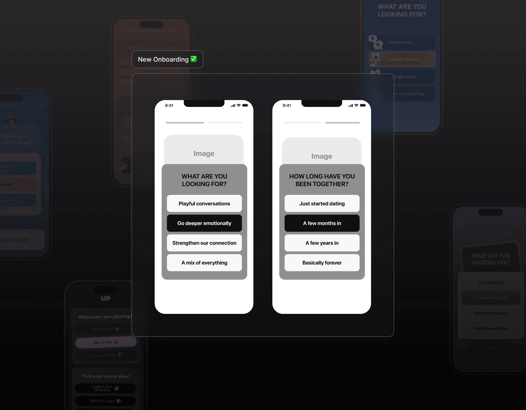
When the pattern moved into our relationship-app line, "quick and playful" wasn't the right tone. The baseline became two questions — "How long have you been together?" and "What are you looking for?" — each given its own screen to slow the pace and feel more intentional rather than snappy. For deeper products like JustUs (daily relationship tasks and practices) and SexRoulette (prompts for a more adventurous night together), we went further still: 3 to 5 questions, for a more thoughtful onboarding experience and richer data to feed later content segmentation.

3. Framework: Questions for established and relationship apps, informational for new party MVPs
Once the MVP-focused sub-department launched, established apps already had enough users to make answer data worth collecting, and enough product priority to act on it through content sorting. New party-game MVPs got the simpler, vibe-setting informational model instead — two steps, illustrations, no questions — since there was no trust established yet to justify asking, and it optimized design, development, and content effort across a genre that would ship far more MVPs than established apps ever needed to.
Relationship-app MVPs got questions anyway: research pointed to this being a vulnerable topic that needed users to feel their situation was being considered, so I proposed dedicating more onboarding effort there specifically to earn that trust — the PM and art director agreed without pushback.
To check the informational model wasn't just a compromise, we ran a small A/B test — informational onboarding vs. no onboarding at all. Conversion came in a little lower than the question-based version, but not drastically, and since new apps were free in their first month anyway, an effortless first impression mattered more at that stage.
Party Up - Established app
Dear Us - MVP deep talks for couples
Charades - MVP party game
Validation
Before launch, I ran an anonymous survey to check how the new onboarding would actually land — my own initiative, designed and run end-to-end. 13 people participated, all in their 20s and working in digital roles, matching the target audience. The questions were built on pain-point research into what specifically frustrates users about onboarding (top of the list — not understanding why an app is asking something) and the same cognitive/behavioral literature that shaped the rest of this project.
The results were clean: no one selected a negative emotion (Annoyed, Bored, and Indifferent all came back at zero) when asked how they'd feel seeing this onboarding. About 83% said they understood why the app was asking its questions — directly validating the research's top pain point. Around 75% said they expected some form of onboarding, meaning adding it wasn't an unwelcome surprise.
Open comments surfaced two real points of friction: confusion over the "couple" icon (two illustrated monkeys), and confusion around labels like "Tease" or "Superstar" — testers didn't realize these were auto-generated player names, not category tags. Both traced back to the same root cause — participants hadn't gotten a feel for the app's tone yet at that point in the flow.
That led directly to reordering the screens so the location/mood questions came before the player-labels screen, letting users pick up the app's playful vibe first; the label confusion itself went to a separate fix (see Experiments).

Experiments
Two answer mechanics per question — worked brilliantly in one app, broke in another. Truth or Dare Fun — vibrant, cartoony, high-energy visual style — used two different input mechanics across its two onboarding questions, and it landed well; the loud visual language made variety feel like part of the fun rather than something needing justification.
About two months later, inspired by that success, we tried the same approach on PartyUp — similar vibe and audience, but a calmer, more techy, neon visual style. We ran it as two sequential A/B tests on PartyUp: first confirming onboarding still beat no onboarding at all (a ~30% lift in free-trial starts, ~18% in retention, first-session playtime up from 560 to 587 seconds), then testing the two-mechanic version against the original single-mechanic one. The two-mechanic version underperformed — conversion dropped 12%, retention dropped 7% versus the original — so we reverted to the single-mechanic version.
My read: visual language does real work here. Truth or Dare Fun's loud, cartoony style gave users permission to expect anything, so switching mechanics mid-flow read as more of the same fun. PartyUp's calmer, more consistent visual style set an expectation of consistency, so the same switch read as unexplained rather than playful — the same interaction pattern sent a different signal depending on the visual context around it.


