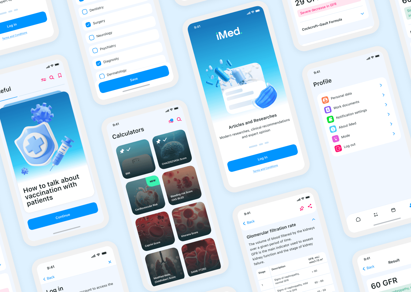
Redesigned a Pfizer clinical app for doctors — reach up 20%, cost per contact down 20%

Context:
A clinical reference and calculator mobile app for doctors, redesigned for Pfizer; Over 35,000 users
01
Contribution:
UX/UI audit and redesign — full visual overhaul of the existing app
Interview research to identify core problems
Competitive analysis
Filtering system
Post-MVP feature strategy and roadmap proposals
Usability test
02
Goal:
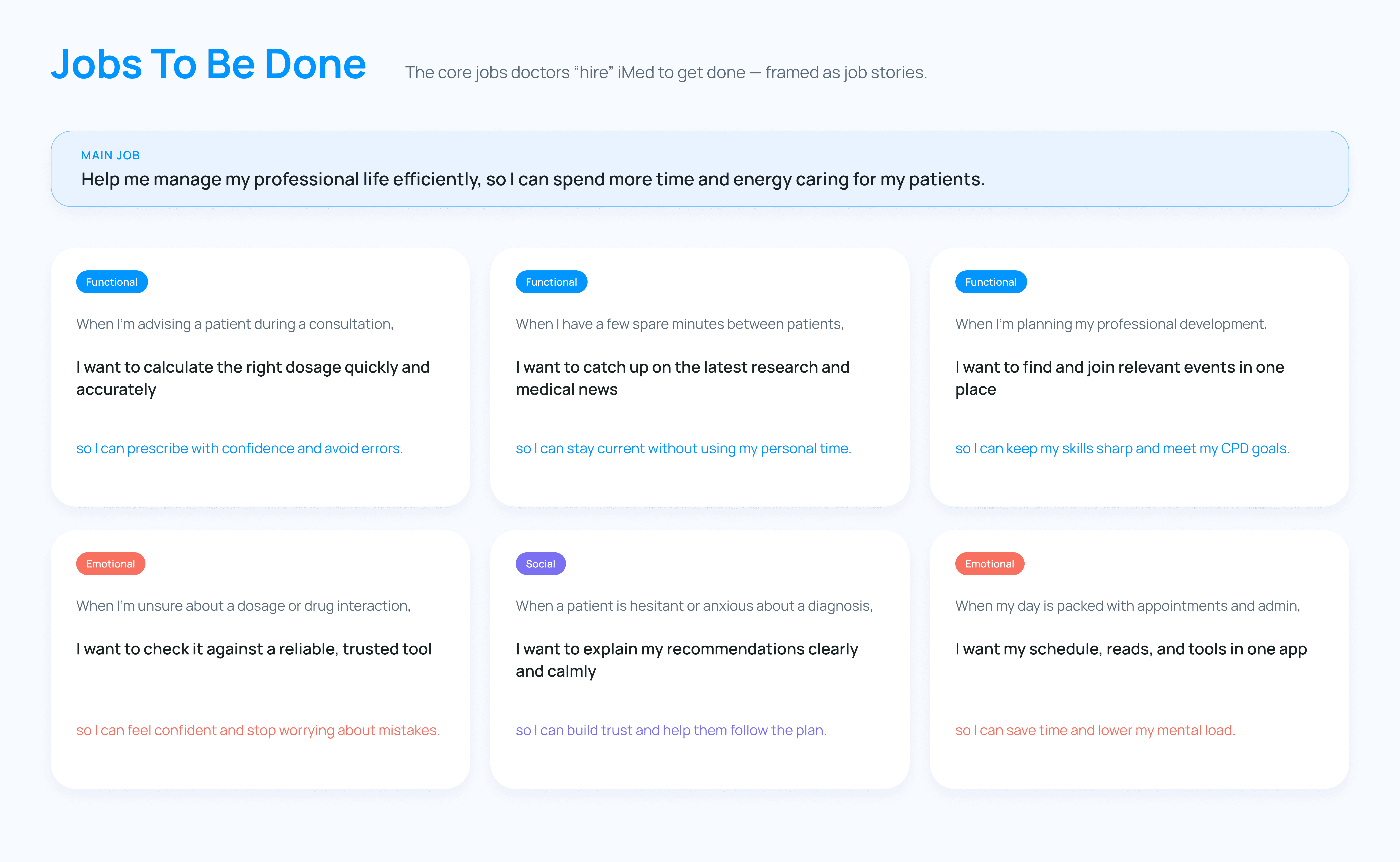
Pfizer needed the app to build doctor loyalty and open a communication channel. My job was to turn that into a product doctors actually want to use.
03
Platform:
iOS • Android
04
Results:
Reach rate +20%; cost per contact –20%; field force activity coverage +10%; 67% engagement rate
Healthcare Simplified: Enhancing Doctors' Capabilities with iMed
iMed is a clinical reference and workflow tool built for Pfizer, designed to bring the resources doctors rely on daily — medical calculators, treatment guidelines, events, and continuing education — into a single, trusted app.
Built for use between patients, not after hours, the experience has to hold up under real time pressure: fast to open, fast to read, fast to act.
Process:
Definition → User Interviews → Competitor Analysis -> UX Audit of ver.1 -> Ideation -> UI Design & Assets → Usability Test → ASO → Launch


Constraints:
Four months, 3-person team, redesigning a live app already in doctors' hands. Pfizer's medical representatives led the interviews, and I participated — advising on the UX-focused questions asked — rather than running the research independently. And because iMed already had real users, nothing could break in the process — though several proposed fixes went beyond visual polish and were implemented directly, not just suggested.
Problem Statement:
The idea originated from insights Pfizer's representatives gathered through informational campaigns and conversations with healthcare professionals in hospitals, clinics, and pharmacies. Doctors consistently turned to colleagues, clinical guidelines, and drug-dosage references throughout the day, and the assumption behind iMed's first version was straightforward: bring all of those tools into one app, and the fragmentation problem would disappear.
Interviews confirmed the demand was real — doctors did want this. But a closer look at how the app was actually being used told a different story: the features doctors wanted were already there, buried under navigation they couldn't get through.
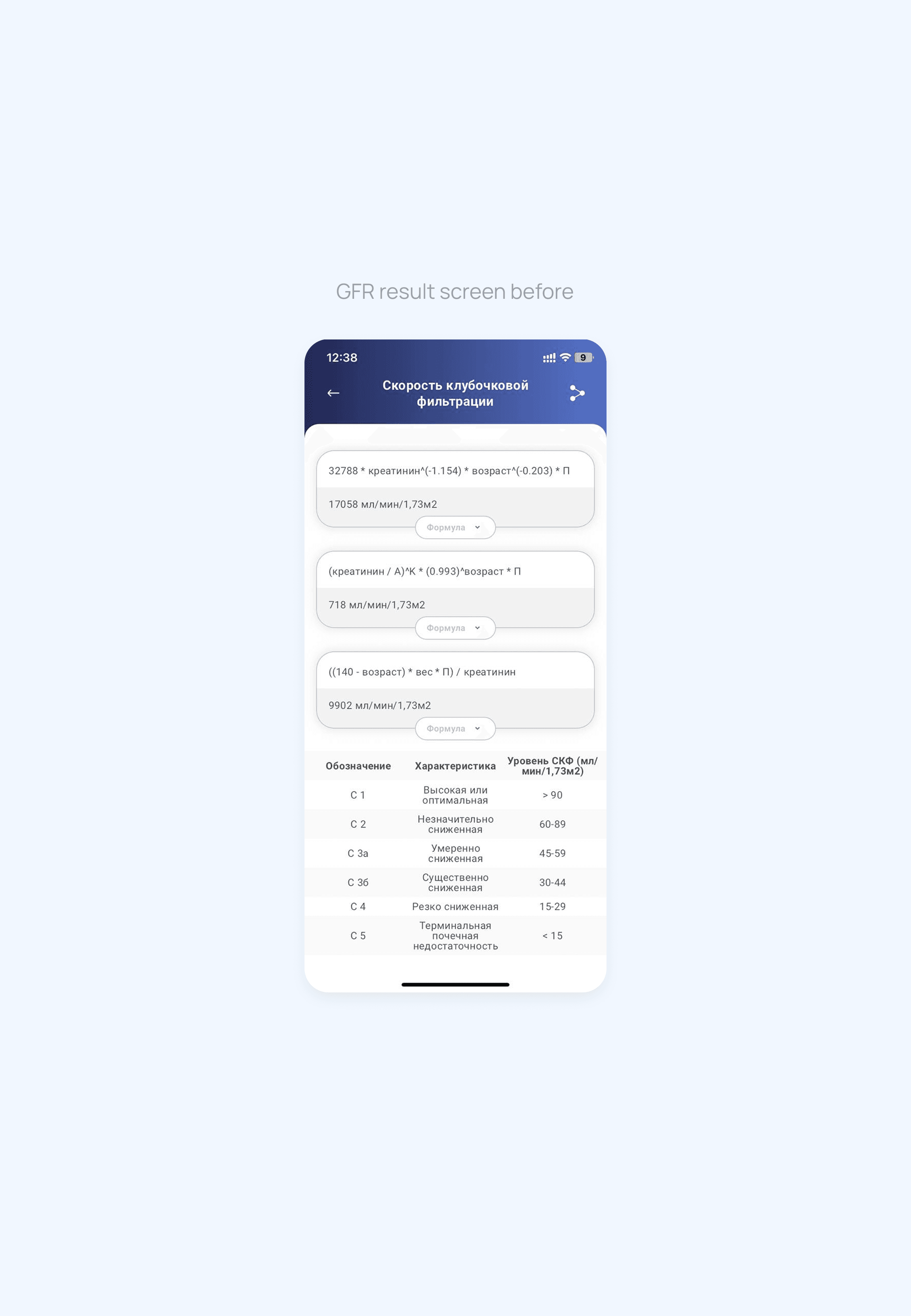
Reach was falling short of expectations, and the friction was a likely culprit — cards blended together without clear hierarchy, filtering and search were missing where doctors needed them most, and calculation results were visually overwhelming.
For professionals who need answers in seconds between patients, that friction meant doctors were abandoning tools they'd already said they wanted.
Understanding the User
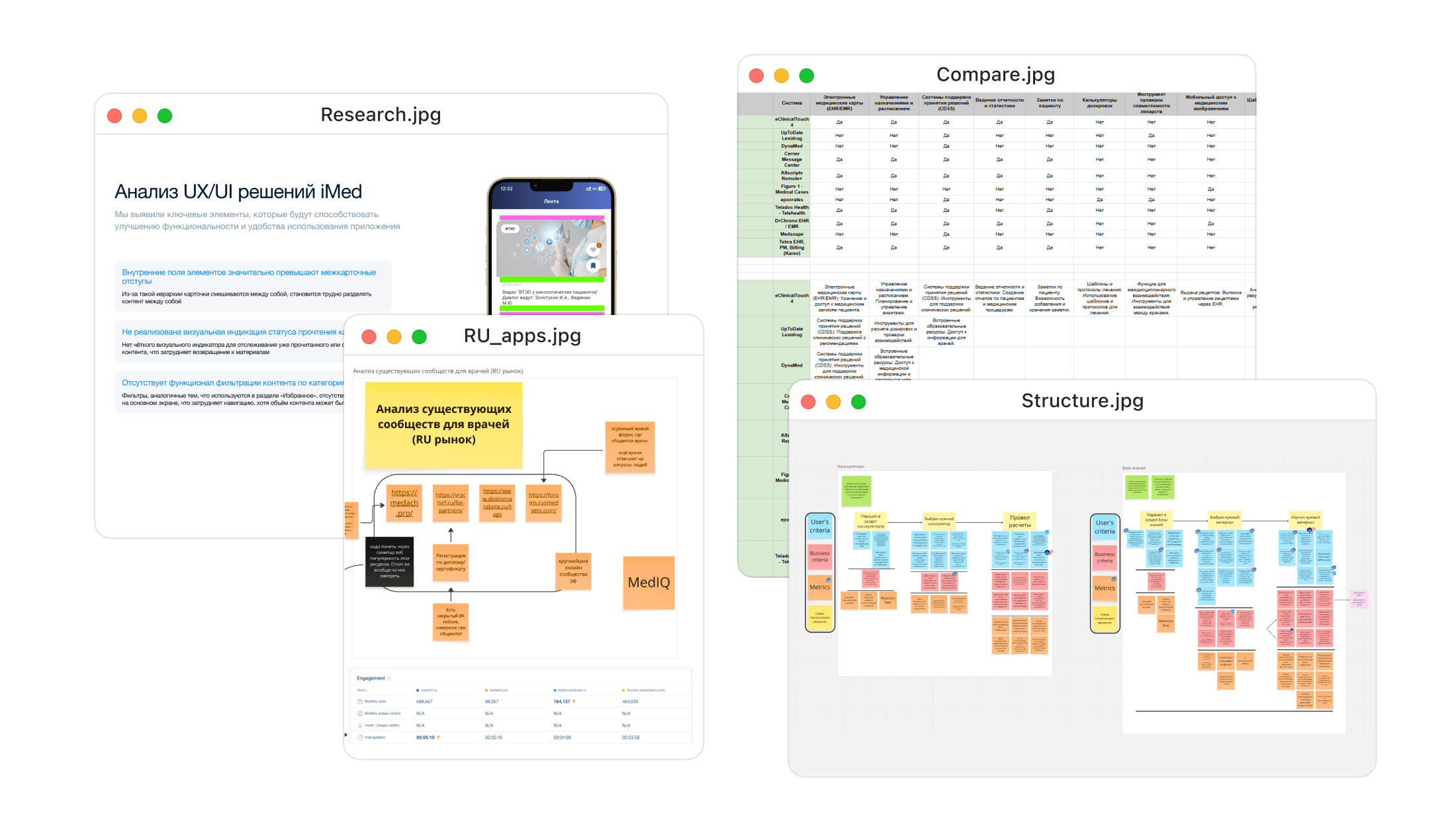
Interviews helped identify the following problems:
Complex navigation
Difficulty finding and saving relevant materials
Confusion around how to sign up for events
To make sure the redesign solved real friction rather than assumed, I grounded it in the interview findings — building a persona around the doctors we'd spoken to, mapping their typical day to see where iMed actually fit in. The goal was fewer obstacles between a doctor and the answer they needed.


Learning from Similar Tools
I looked at both adjacent clinical tools (UpToDate, DynaMed, eClinicalTouch) and direct competitors in the Russian market to understand what doctors expect from an app like this. Dosage calculators came up as a near-universal, heavily-used feature — validating that iMed's calculator flow deserved special attention rather than being treated as one feature among many. I also found that most direct competitors covered only a fraction of the functionality iMed already had; the gap was execution rather than scope.

Key Decisions
1. Rebuilding the App
The original structure worked against doctors instead of for them. The navigation menu had 6 items — Home, Library, Calculators, Events, Profile, and Saved — with events and articles mixed together under Saved, while saving calculators wasn't available at all. I proposed cutting it to 4 for easier navigation:
Knowledge Base (formerly Library) became the new Home. The original Home screen was nearly empty, and the new name better represents the content it holds
Events
Calculators
Profile
The standalone Saved tab was removed, and "saved" became a filter within each content type instead — so a saved article stays with other articles, and a saved event stays with other events, rather than mixing both in one undifferentiated list.
Filtering was also missing from the feed itself, so doctors had no way to narrow down content once past the homepage. I added filters to Knowledge Base, Events, and Calculators.

2. Hierarchy and Visual Update
The visual style also needed polishing to feel current and trustworthy for a clinical tool. Cards blurred together with no clear hierarchy — inconsistent spacing, similar-weight text, and no visual distinction between content types made it hard to tell one piece of content from another at a glance.
For doctors scanning quickly between patients, that ambiguity slowed down exactly the moment where speed mattered most.


3. Rebuilding the Calculators
iMed brings the calculators used daily into one place — redesigned with a clearer visual system and filtered by specialty so the most relevant tools surface first.
Frequently used calculators can be pinned and stay accessible offline, so a weak hospital connection doesn't slow anyone down. Each calculator also now links to its source, giving doctors a way to verify the numbers before trusting them in a real decision.
Better visual structure and color coding made complex results easier to read at a glance. Take the Glomerular Filtration Rate calculator — one of the more data-heavy tools in the app: Informal test with 10 participants: comparing manual lookup (matching a raw result against the staging table) to the automatic color-coded interpretation, average time to correctly identify severity dropped from ~60s to ~10s.


Additional Decision: Dark Mode
iMed also supports dark mode — a small addition, but a meaningful one for doctors checking the app during night shifts or in dimly lit rooms without disturbing patients or colleagues nearby.


Post-MVP Suggestions