B2B SaaS for Parking Enforcement & Management Platform

Context:
I solved Information Overload for Parking Operators by Restructuring Navigation, Overview Dashboard and Improving Usability — resulting in Higher Satisfaction Rate and Less Support Requests
01
Contribution:
UX/UI audit and redesign — full visual overhaul of the existing app
Product strategy planning and discussion with stakeholders
New dashboard homescreen
Customer flows
Customer satisfaction survey
02
Goal:
Redesign the platform to fit the Company's new visual direction, modern visual style and improve customer experience and satisfaction by improving navigation, data visualization, UX flows and platform architecture.
03
Platform:
Web. Desktop & Mobile
04
Results:
More intuitive and user-friendly design elevated customer satisfaction from 3.2 to 4.8 and less customer support requests
Parking Enforcement & Management Digital Platform redesign to improve customer experience and satisfaction from 3.2 to 4.8
The Company is an AI and machine learning - enabled parking management solution, which helps institutions, authorities, colleges, municipalities, facilities and police departments streamline parking enforcement processes.
Process:
Definition → User Feedback Analysis -> UX/UI Audit of ver.1 -> Flows Arcitecture -> UX/UI Redesign & Design System → User Survey → Launch
Constraints:
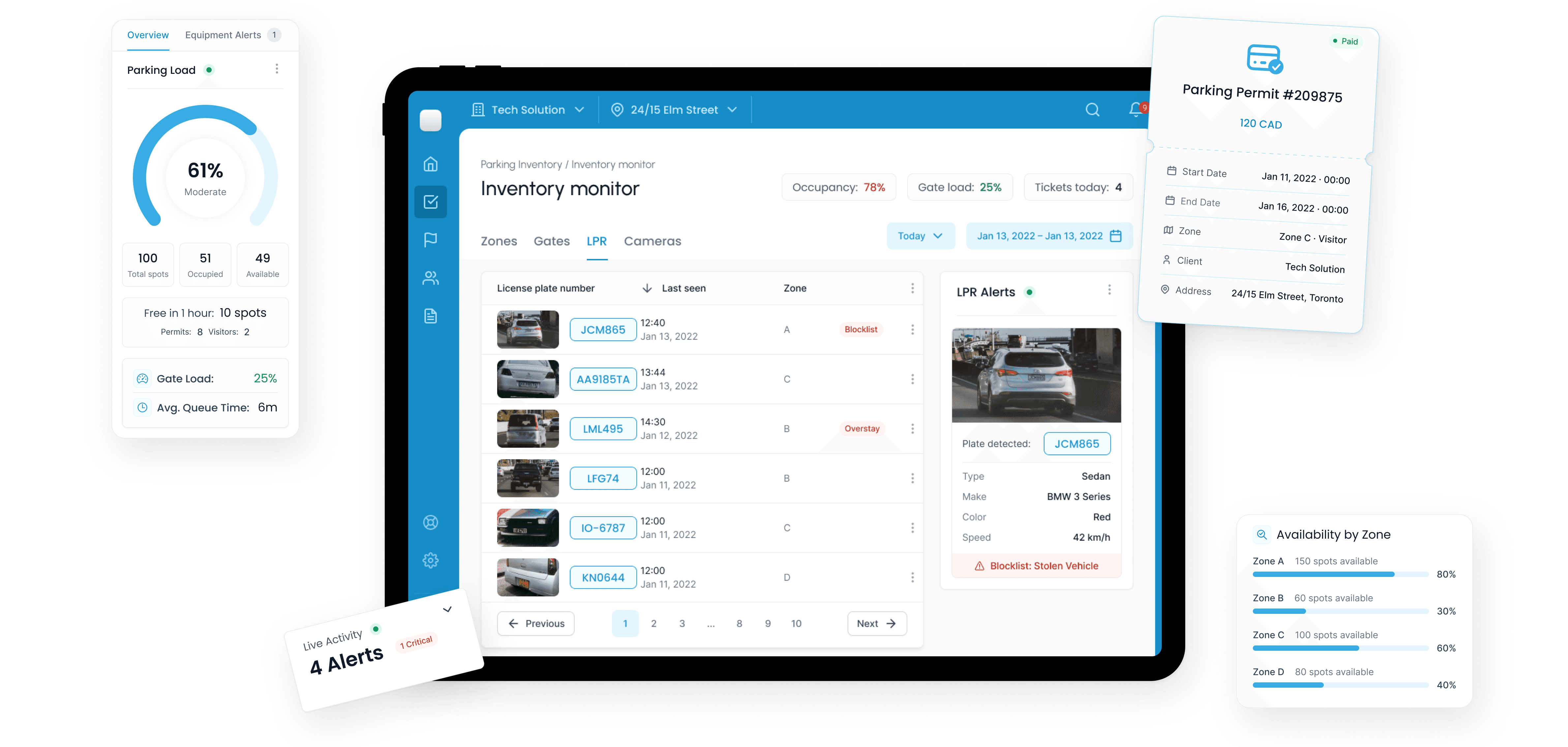
The Company already had a large pool of permanent customers, including police departments, municipalities, and private companies. The redesign had to be very different from what they were used to, without adding a learning curve for existing customers. Because most of these customers were locked into multi-year contracts, retention wasn't a useful signal for whether the redesign actually worked. That's part of why we built the feedback form instead of waiting to see contract renewals: we needed a way to measure impact directly, rather than relying on a metric that wouldn't move for years either way. While I wasn't explicitly rushed, quick delivery was preferable, as the website was already live, so the company wanted the software redesign matching the new branding to be available as soon as possible. In addition, the product was growing and evolving alongside technical progress, so they needed a new, modern, and scalable design system and component kit. The visual direction had already been set during our previous collaboration with the Company on rebranding, the new visual direction style guide, and the redesigned website.
Problem & Strategy
Outdated style and confusing layout organization caused users and clients to complain and fall off (especially in the private sector and among businesses targeting young people), due to the software's visual complexity and high learning curve. In addition, the product was growing and evolving alongside technical progress, so they needed a new, modern, and scalable design system and component kit.
Before we started, we had several planning meetings with the stakeholders to decide what vision we had for the updated platform. We identified key problems, confirmed our priorities, and discussed our vision of what success would look like.

Survey and feedback analysis showed that users appreciated the functionality but struggled to navigate the dense and complex interface.
Visual Direction
The company is a recurring client of Impressa Solutions, so the visual direction was developed during our first collaboration, for a full-circle marketing strategy and rebranding.
For this tool, we used the Design System we had already created and elaborated on it to fit the platform's purposes, flows, and complex data management. We kept the typography and colors but developed a interactive elements and data table components to make the tool responsive and the.

Key Decisions
The big challenge was creating a universal tool. Almost half our customer base isn't revenue-driven at all, so the product had to work for a wide range of customers, from government and public institutions to private business.
Key decisions we made:
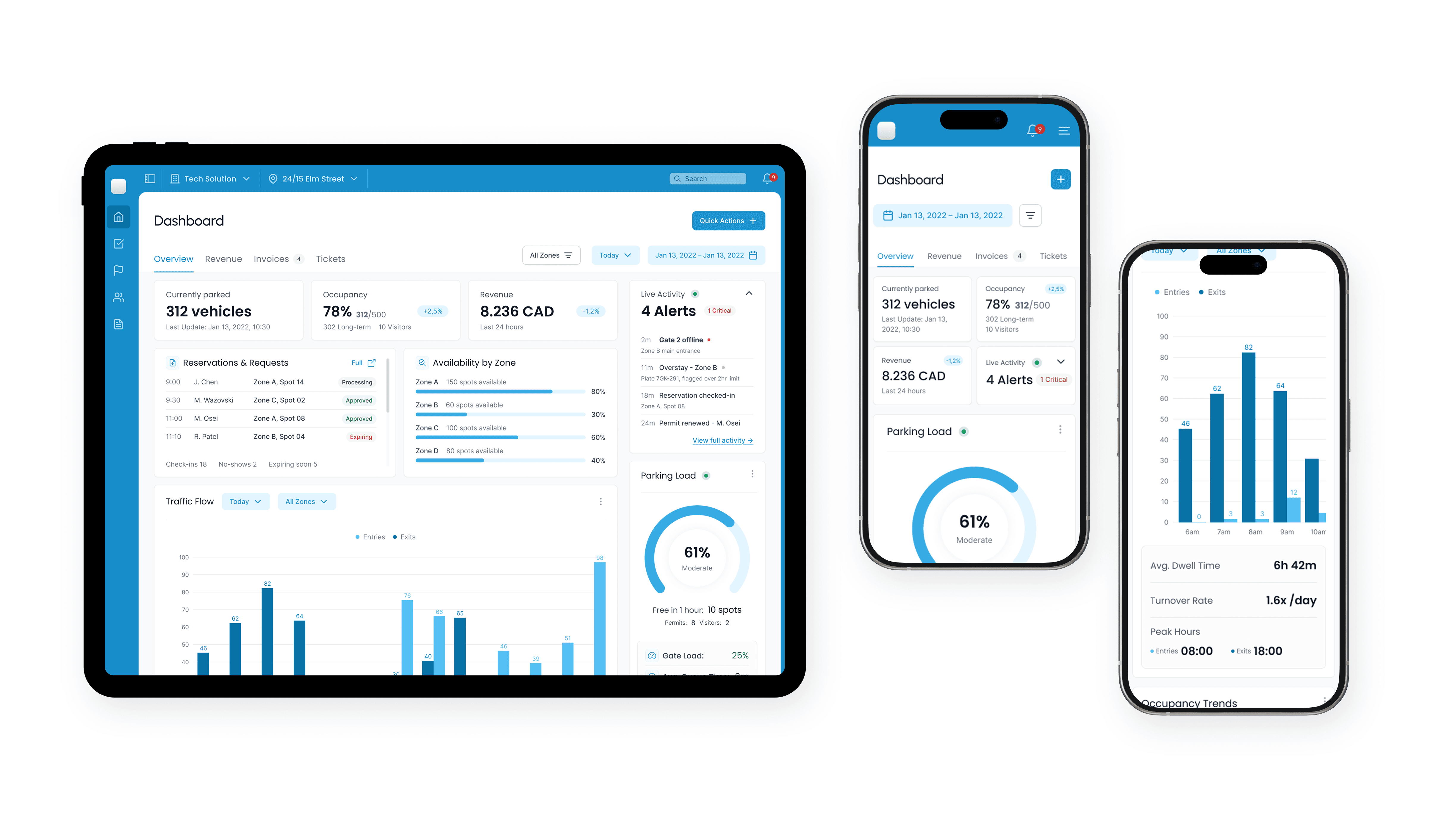
A focused overview dashboard. Short, glanceable snippets of the most important things universal across customer groups (alerts, permit and reservation activity, occupancy) so any operator gets useful context immediately.
Responsive and flexible data tables. The same component works as a quick log on a laptop and a full audit-ready view on a large monitor, without us maintaining separate tables for each persona or each breakpoint.
Information architecture built around job-to-be-done. We organized the tool around why someone's using it. The three motivation clusters branch straight into features and then into real need statements, like "as an enforcer, I want to instantly verify a valid parking right." That's what kept the navigation compact and focused on curated content section and intuitive flows.

New Feature: Overview Dashboard
Dashboard was the most important task, as the previous iteration didn't have an overview dashboard to cover the essentials. Instead of designing around feature categories, we designed around the 3 motivations we'd mapped: activity snapshot for enforcers, a revenue snapshot for operators, load and utilization for facility managers. It took me and the Client's team several iterations to find the perfect balance. Some of the early wireframes relied on showing revenue too heavily, others didn't make much sense in terms of information segmentation or eye-movement pattern. The core priority was to keep it universal across customers but minimal and useful. An operator cares about revenue, a police department cares about compliance, a hospital just needs its lot to not overflow.

Data Tables
One rigid table couldn't handle every kind of variation, so we made the tables flex on two axes: which columns and density show up for a given task, and how the layout reflows across screen sizes. The same component works as a quick log on a laptop and a full audit-ready view on a large monitor, without us maintaining separate tables for each persona or each breakpoint.
Moreover it needed to be easy to scan, user friendly and intuitive across the contexts. Make "data-heavy' feel 'light'.

Management Tools
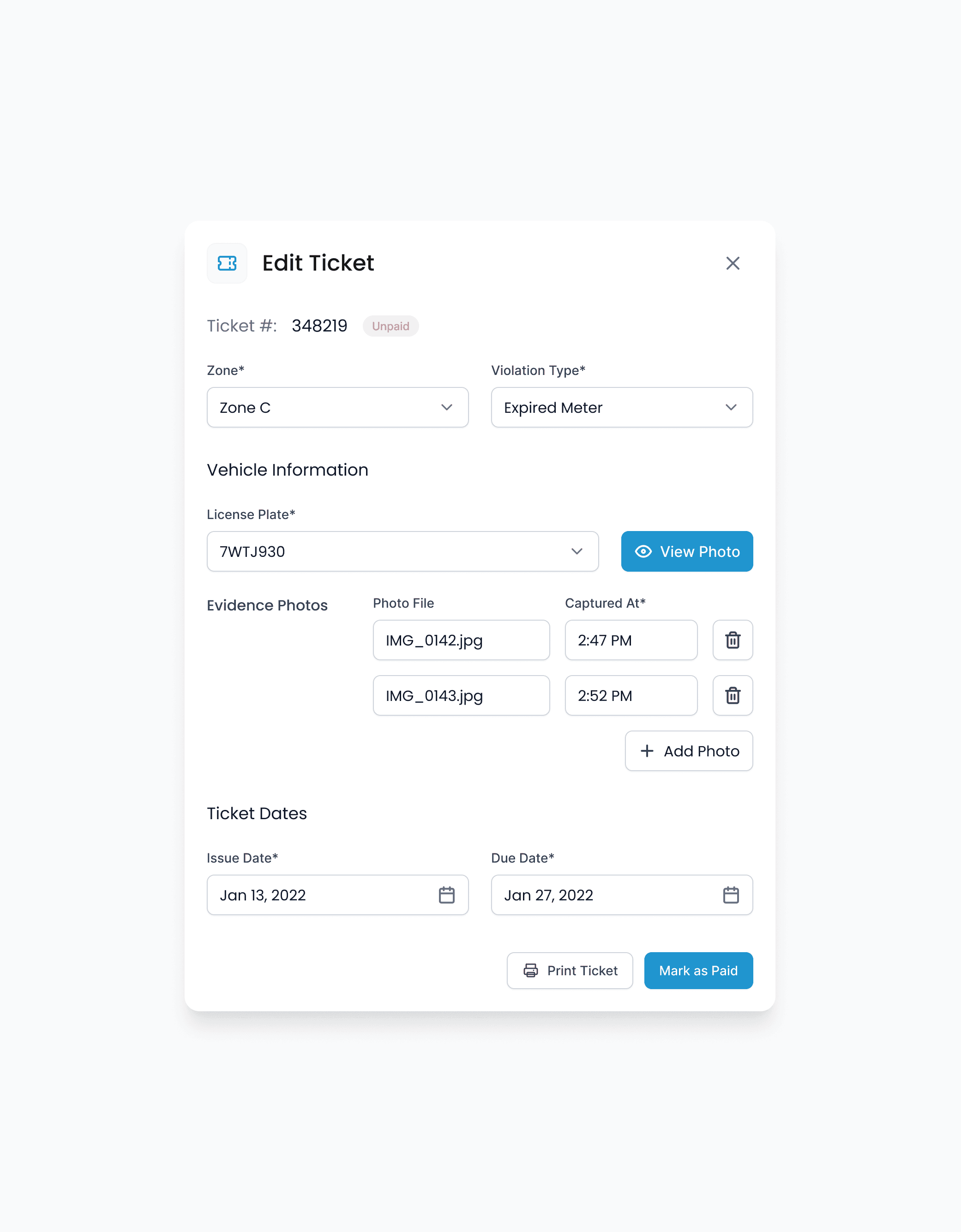
Management and operations flows were so confusing that users had to contact customer support just to perform routine tasks. So, alongside stakeholders, we spent extra time designing simpler, more intuitive flows for these areas.
The core idea was to keep closely related actions and tools side by side: adding a new invoice or permit right above the data table, or switching between Parking Inventory sections without leaving the page or jumping to a different screen.


User Survey
To make sure the redesign did its job, I designed a feedback form, and stakeholders implemented it inside the tool. After a user interacted with any of the management tools, it appeared in the corner asking about their experience. We launched the first iteration of this form as soon as the brief was created, so we could gather pre-redesign satisfaction scores and compare them later. Both times, we collected answers for 3 months. The score jumped from 3.2 to 4.8, and users highlighted the ease of use and the more modern visuals.

