Designed 0→1: a first-of-its-kind mechanic that locks the apps you check most — until you've practiced

Context:
The core idea is to lock selected applications and unlock them only after the user completes a learning session
01
Contribution:
Participated in discussions about features
Designed Onboarding Flow
User Interface for all the sections
Scalable design system
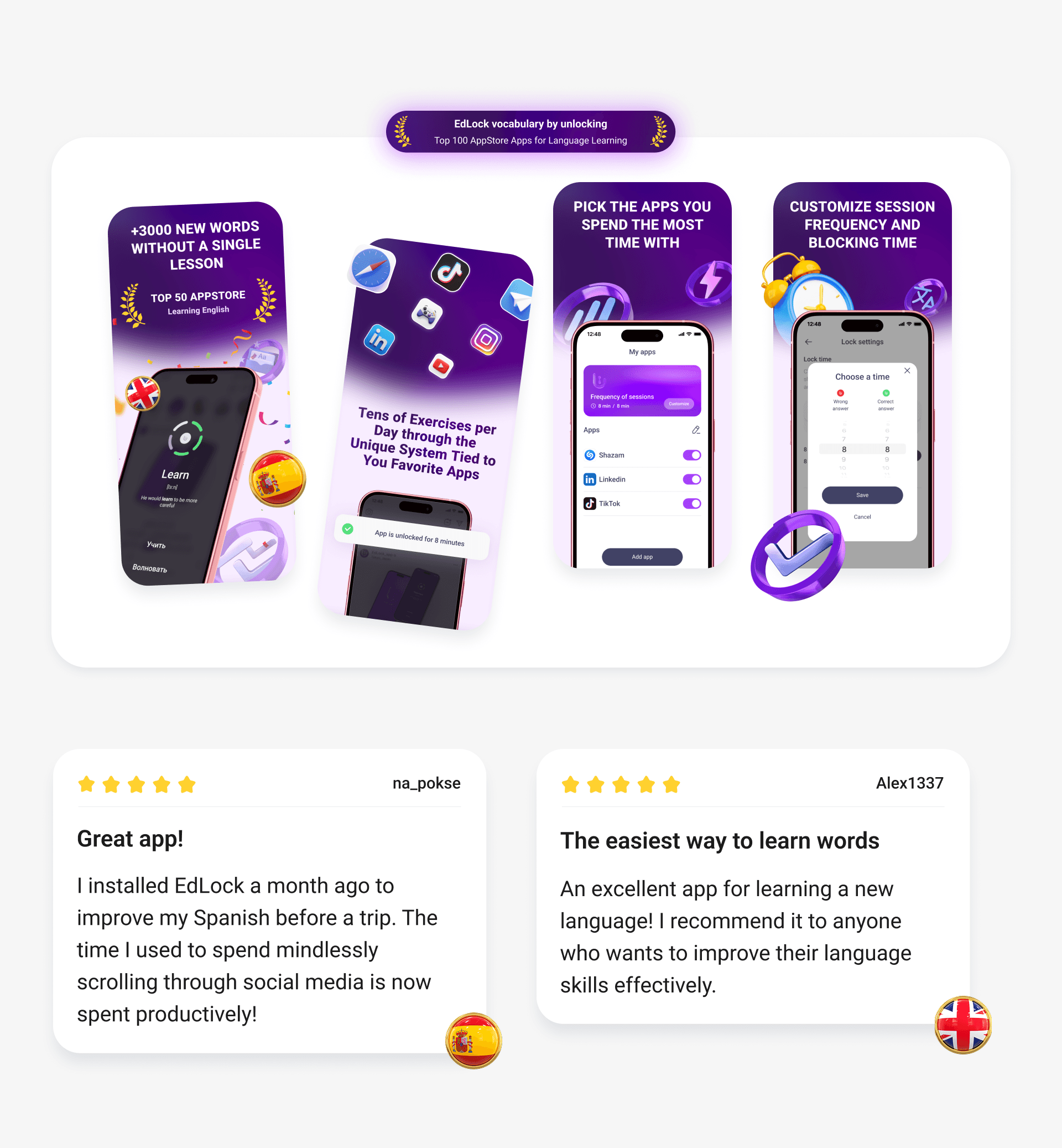
ASO assets and Landing page
02
Goal:
To build an MVP to test a novel interaction pattern from scratch
03
Platform:
iOS
04
Results:
20% retention in 1 week; Expanded from Russia to Kazakhstan
EdLock locks the apps you check most — and unlocks them once you've learned something
EdLock — is a modern language learning app turning procrastination into knowledge. EdLock helps you learn new words while using your everyday apps. There’s no need to set aside dedicated study time, as learning is seamlessly integrated into your daily routine.
The core idea of the app is to lock selected applications and unlock them only after the user completes a learning session.
Both the locked apps and the session duration can be customized for more flexible learning experience.
Process:
Definition → Concept Development → User Flow & Wireframes → UI Design & Assets → ASO → Launch

Constraints:
As designer on a four-person team, I owned EdLock's design end-to-end over roughly a year (including implementation and launch)— building a lock-and-unlock mechanic with no existing market precedent to benchmark or adapt, which meant validating the interaction model from a blank page through an MVP built specifically to test whether it worked before any further investment. The mechanic also depended entirely on OS-level permissions (screen time and notification access), so the very first interaction had to earn enough trust for users to grant that access before ever experiencing the payoff. Positioning and go-to-market strategy sat outside my scope, handled by the founder, while I owned the UX flows, onboarding, and launch assets.
Problem Statement
Learning apps see some of the steepest early drop-off in the industry — even average apps across all categories retain only 11–13% of users by day 7.
Motivation is highest the moment someone installs the app, but fades fast once daily practice starts requiring active effort and willpower. Most learning apps lose the majority of their users within the first week, before the habit ever forms.
Solving this meant rethinking the experience at every stage — from the first screen a user sees to the habits that keep them coming back.
Visual Direction
The visual direction leans modern and techy while keeping the interface clean and friendly.
Purple and white form the core palette: purple sits between the calm of blue and the energy of red, a pairing well suited to a habit-forming learning app that needs to feel both focused enough for daily practice and energetic enough to sustain motivation. It also sets EdLock apart from most language-learning competitors, who lean heavily on blue or green, giving the app a distinct identity.
Rounded corners soften the interface and keep it approachable, while the primary shape stays rectangular — reinforcing the structured, disciplined feel.

Concept Development:
The work started in Miro, working through which apps to lock, how sessions should be structured, and how the mechanic itself should feel before any real screens existed.
Ideas were color-coded to separate different threads of thinking — yellow for process steps, green for core user goals, blue for user needs, and red for team priorities spanning business, function, and metrics — with early wireframes sketched alongside to stress-test rough flows before formal UX work began.

Key Decisions
1. Onboarding Flow and Subscription
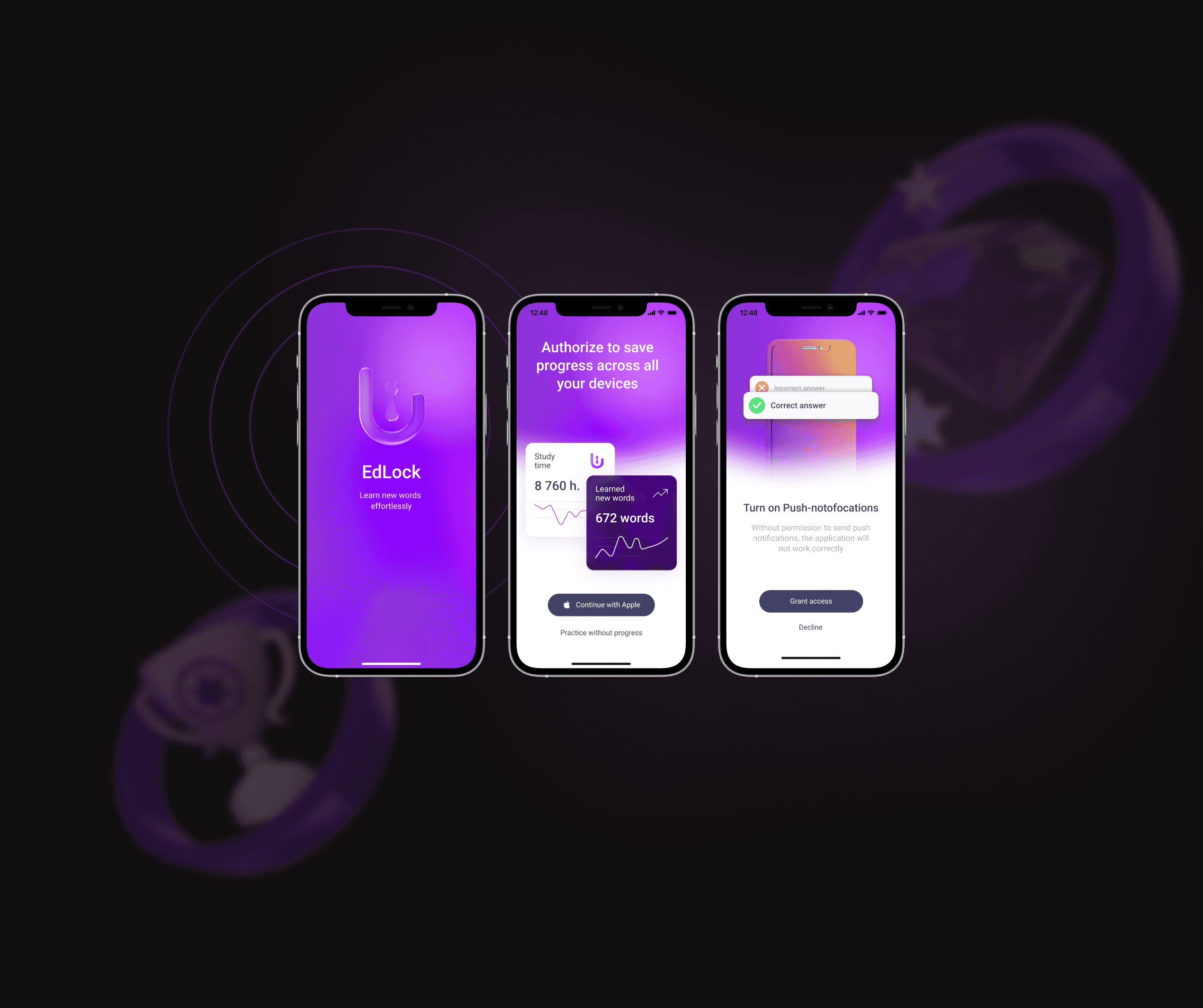
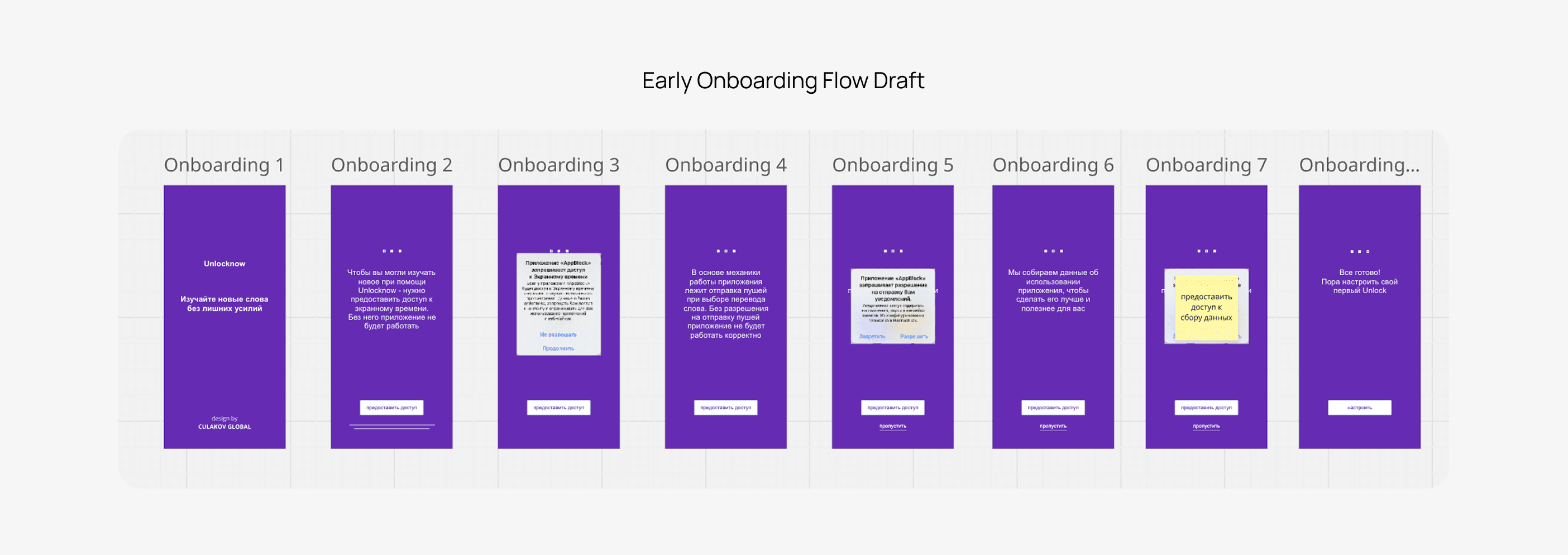
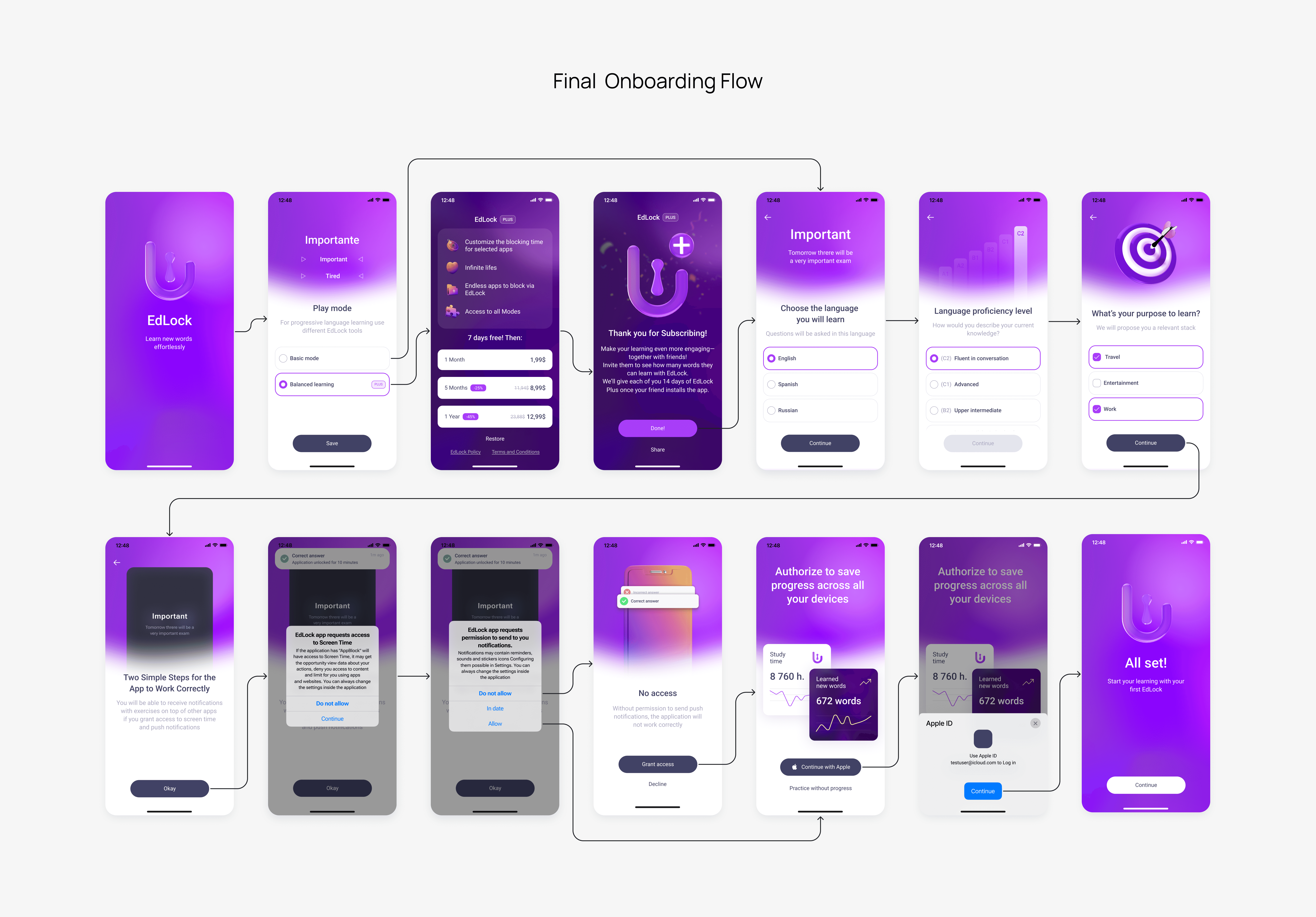
Onboarding walks users through screen time and notification permissions, using lightweight Lottie animations to keep the interface engaging.
Along the way, it sets user preferences and gently introduces the core lock-to-learn mechanic, easing users into an interaction pattern they've never seen before and building a sense of ownership that strengthens motivation. Step-by-step flow and progressive disclosure make sure users can proceed at a comfortable pace without feeling overwhelmed.
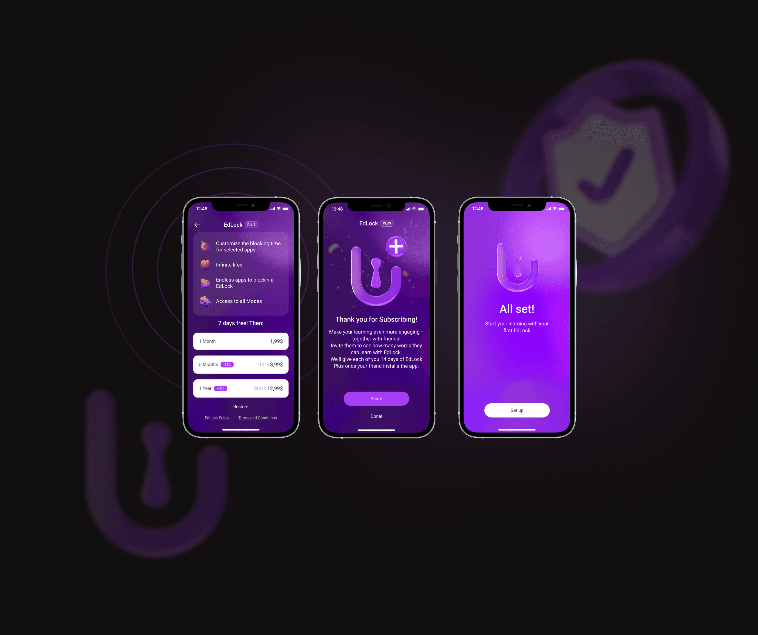
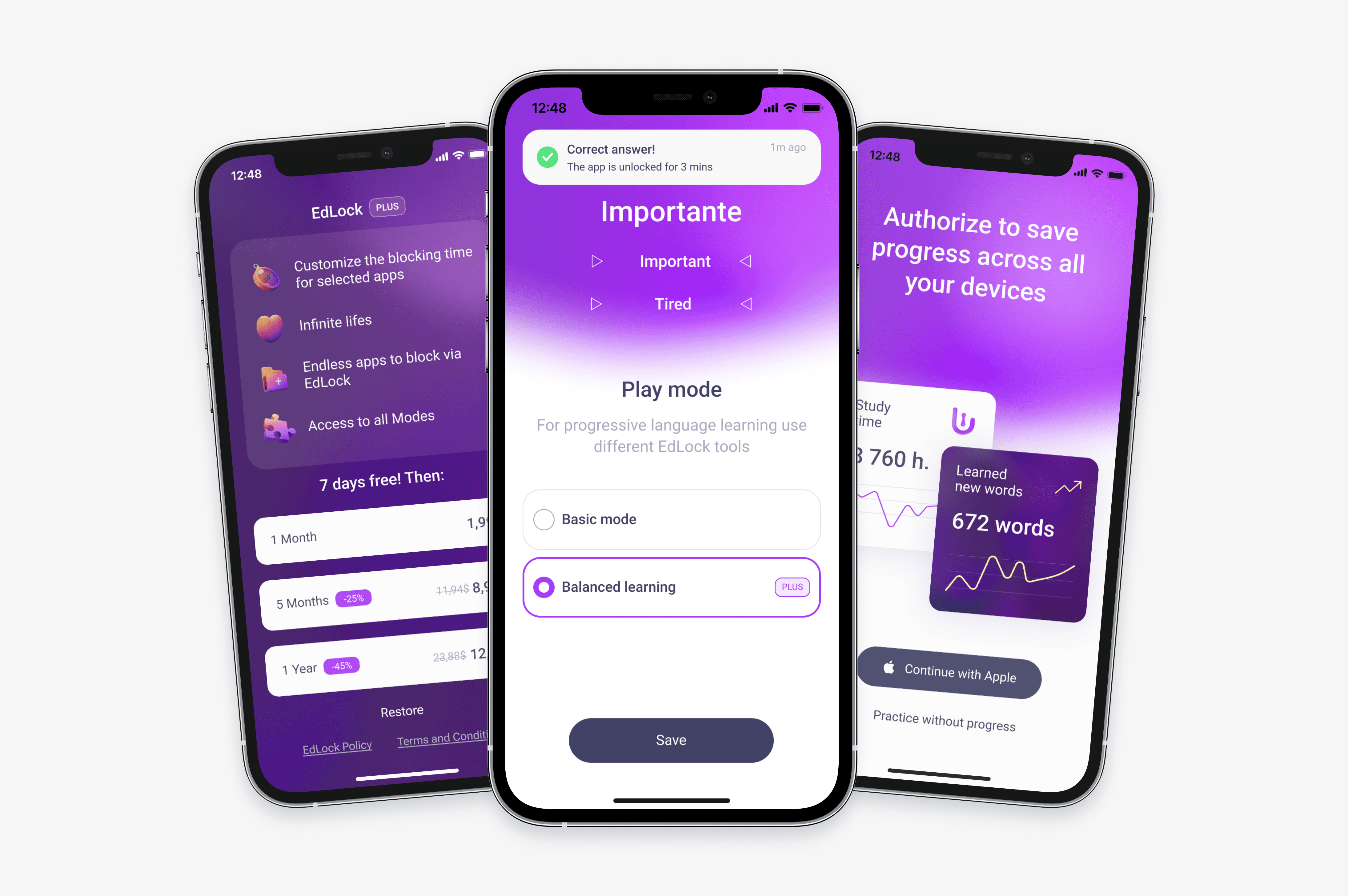
The subscription model stays simple and transparent — no pressure tactics, just clear value — with users able to subscribe during onboarding or later, once they've explored the app.
2. Customization - Do Once, Then Let It Run
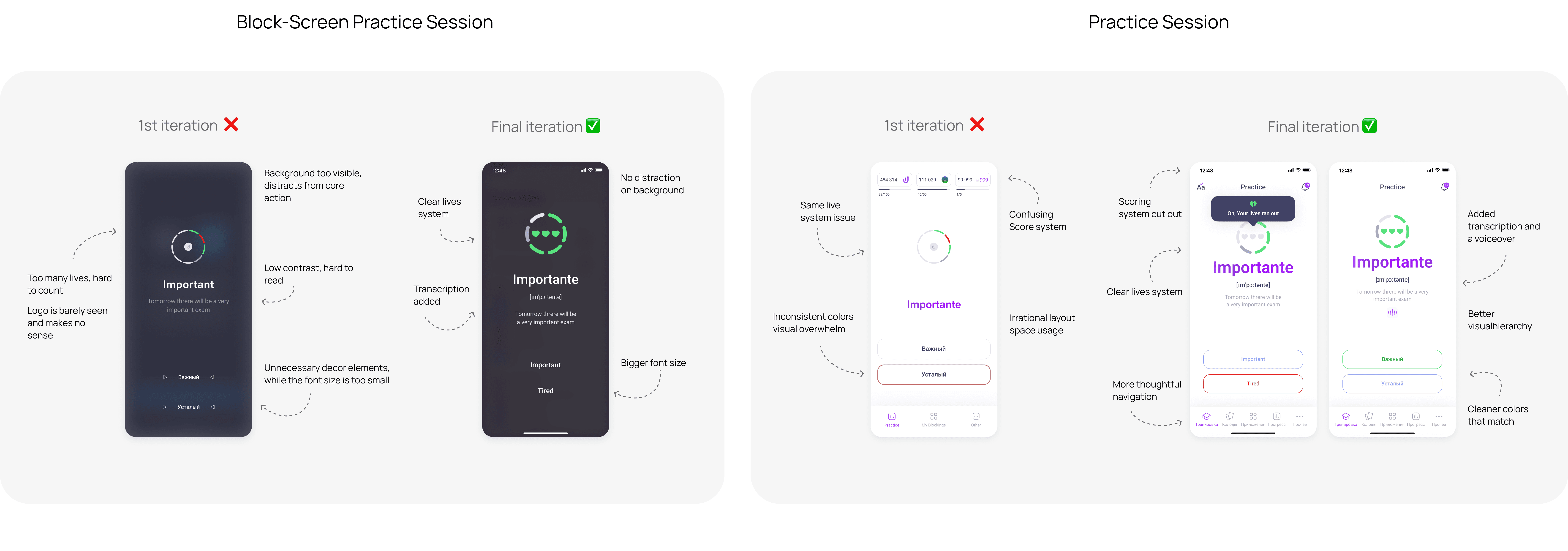
While motivation is highest, users choose which apps trigger a quiz and how long each session lasts. Frequency is fixed in the basic version and customizable in EdLock Plus. The app suggests adding your first app to the block list right after onboarding, with a small, non-invasive preview — so the user knows what to expect upfront. The timeframes have a default value, so setting them all at once isn't necessary — however, the edit banner is noticeable enough that it's intuitively clear how to set the time. After that, the process runs on autopilot, with no further decisions required. Design-wise, we were chasing cleanliness and clarity, so the settings-heavy flow isn't disrupted by heavy visuals — which is why we abandoned two earlier iterations. Both were visually complex: • 1st iteration nearly lost the main call-to-action button to low contrast • 2nd iteration wasn't clean enough, with unnecessary grouping


3. Calculator for Language Proficiency
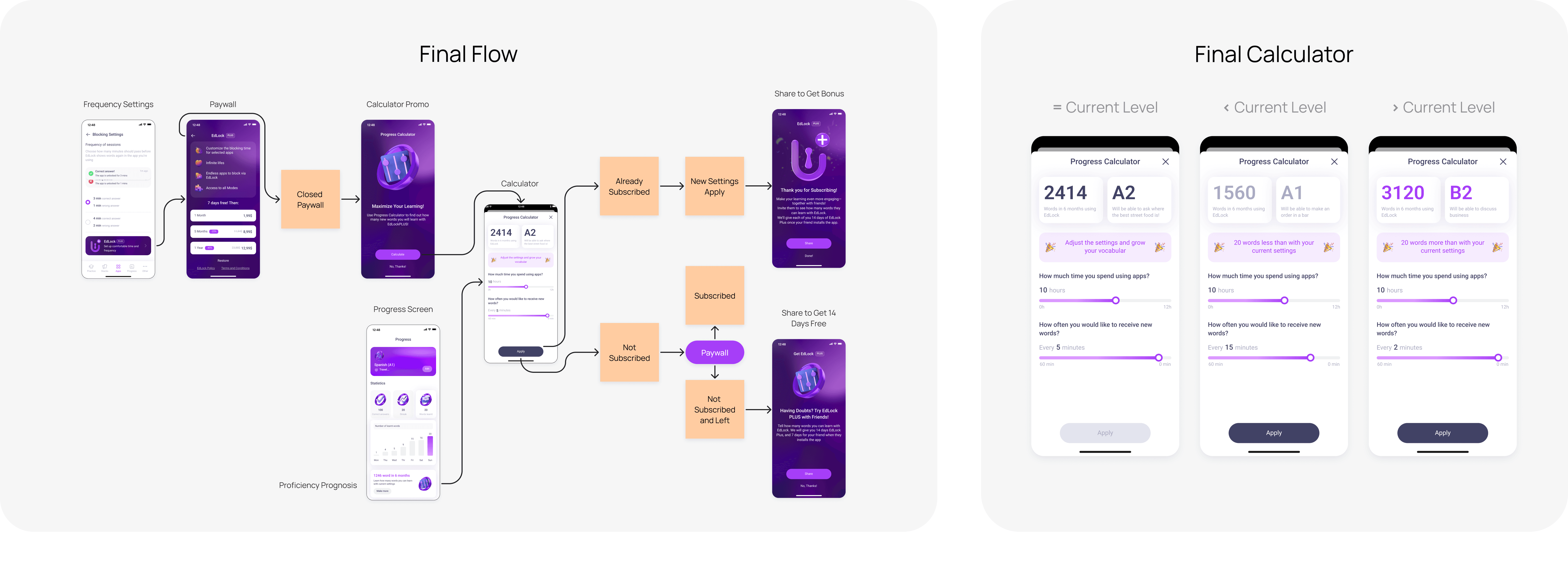
The calculator has two entry points. It lives permanently on the Progress screen, so any user can check how many words they'd learn under their current settings. It also appears as a premium banner within the frequency screen in Blocking Settings, acting as a trigger into the paywall. If a user leaves the paywall without subscribing, the app suggests the calculator instead — a chance to show, rather than just tell, how much more they'd learn by adjusting their settings.
It's an information- and action-heavy screen, so it needed to feel visually appealing while staying intuitively understandable.
The first iteration kept the same visual style as the paywall, but it felt too intense and visually demanding for a screen users would return to regularly, so we shifted toward something more approachable. A few further iterations followed, but none struck the right visual hierarchy. In the end, I brought the screen closer in style to the rest of the in-app experience and added a language-level projection alongside the word count — giving users a clearer, more motivating sense of progress toward their goal.

4. Low-effort, Automatic Mechanic
EdLock doesn't ask users to find time or rely on willpower — the mechanic triggers on its own, built into apps they already open throughout the day.
The lock screen interface is customized using the SwiftUI framework. Restrictions on other apps are implemented via the Screen Time API, which also enables saving quiz results within the EdLock app. An extension sends local push notifications after the user submits an answer. This is an original technical solution with no direct analogs.
If users craving more - they can practice voluntarily in the dedicated tab - just like any other learning app.
When we approached the Practice Flow, we ran a small usability test and found that the initial scoring system was confusing and its complexity was repulsive to users. This insight led us to restructure the navigation, simplify the Practice Flow, and focus on the learning experience.

5. Gamification Keeps Motivation Alive
Progress stats and achievement badges let users see how far they've come — a visible streak, a rising word count, a badge earned along the way.
These small, recurring wins turn invisible daily effort into something concrete and rewarding, giving users a reason to keep going even after the initial motivation fades.


Facing Apple’s limitations
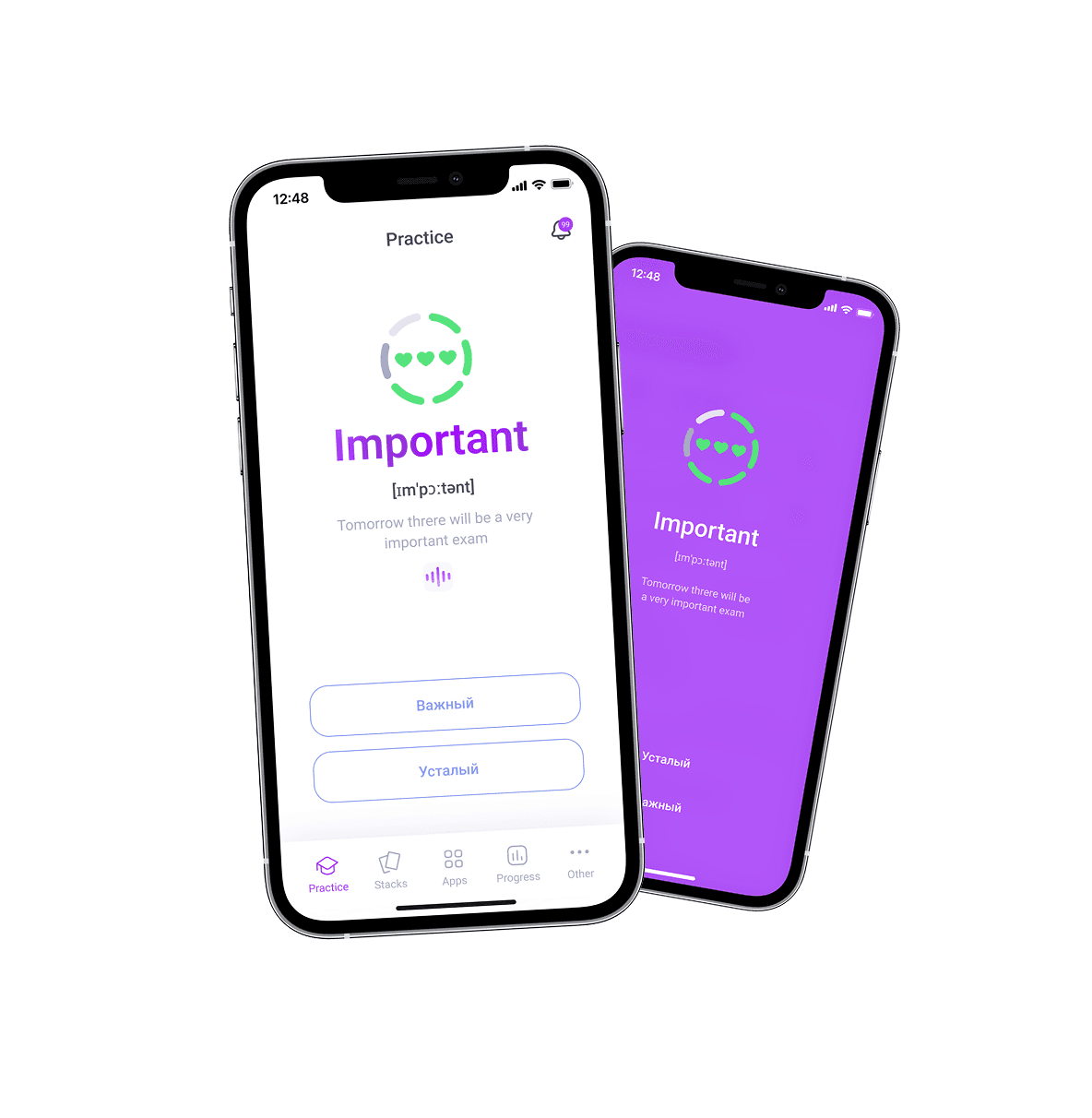
During development, Apple-imposed limitations related to design and app access were identified. Gradients were not allowed, and it wasn’t possible to freely customize the background, fonts, or text size, so blur and transparency effects were introduced to add visual dynamism to the interface.

Deliverables & Assets